Three Quality Data Traps
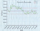
Before personal computers changed everything, weekly charts of accounts receivable were done by hand. Source: PQ Systems
When technology makes things easier-as it always does-it also comes with its own set of complexities. The development and widespread use of the personal computer is no exception. A computer can do in minutes what it used to take hours or days to accomplish, revolutionizing the way that data is reported and at the same time creating greater expectations about that data. Before personal computers changed everything, for example, weekly charts of accounts receivable were done by hand. Employees rooted through file cabinets, looked at invoices and jotted figures on sheets of paper.
Next, they used graph paper, perhaps splurging on color felt tip pens, to make rudimentary line charts. When the quality manager presented charts at the monthly meeting, imagine the sigh when the CEO asked the simple question “What does that weekly chart look like by month?”
Enter the PC, designed to make data readily available. Add quality analysis software, and the data is easily massaged. Or is it?
The Quality Domain
In almost every business today, data flows from the operations of the business into various software systems. Accounting, inventory, resource planning, contact management, patient health records, order fulfillment, quality management and other disciplines have been systematized. Each of these departments provides its own view of the data it manages. This view might be thought of as a domain-specific report. The report fetches and massages data, then formats it for presentation.Many of these software systems allow reports to be customized, but the reports often leave more information to be learned from the data. The “accounts receivable” chart is a good example. A standard report might give a comparison of this month to the same month last year. What if you want to know the weekly mean over time? Can trends be detected? Is variation increasing or decreasing? Do signals exist that indicate problems or opportunities?
These are questions Six Sigma professionals are trained to ask. They are from the quality domain. Often, the questions are focused on quality metrics such as customer satisfaction, number of errors and number of defects. However, they can provide insight when asked more broadly about data flowing into other enterprise systems. But when the data to be analyzed for a Six Sigma project is flowing into other software systems, how do you chart it? This is a challenge for many quality-focused, variation-minded professionals.
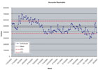
A control chart of monthly accounts receivable from data in Excel, with a trend line to show the improvement. Source: PQ Systems
Trap #1: Move the Data
One solution is an old stand-by. It has been around a long time and many people use it-it is called move the data. For example, one selects a Six Sigma project to reduce the number of accounts receivable over 60 days. The data resides in the accounting system but you want to make a control chart, using a quality software program. First search the accounting software’s help files and figure out how to export data from the accounting system. Then do the same to learn how to import that data into the quality charting software.Along the way, the oddities of each program and the file formats they support are discovered. Eventually, the steps are remembered from week to week-but they remain as a manual process. Next is the desperate search for ways to automate the process. After all, this weekly task is time consuming. So a macro program is written or a scripting tool is used to automate the task.
Now it is working just the way it should. Life is good. Then, during a meeting, one of the team members asks a simple question. “I wonder what it looks like by month?”
Are we that much better off than when we used felt tip pens and graph paper? Yes, the software allows us to crunch a lot of data quickly, but the move-the-data approach involves three potentially deadly problems.
1) The data being analyzed is a copy of the original data. The copy can be obsolete within minutes of exporting it from the source system. Data may have been added or even changed in the original system. By the time the chart is presented to the CEO, the data is stale.
2) Moving the data causes repetitive work. Even if the work is mostly automated, it will have to be repeated each time a current assessment is needed. PCs facilitate this, but each step in a process is an opportunity for something to go wrong.
3) Finally, move-the-data systems are brittle. If the CEO wants an additional variable added to the analysis or a team member wants to stratify the data in some new way, the system must be reworked, often from scratch. Rework is tedious, time consuming and wasteful. This waste directly affects the bottom line.
Trap #2: The Wrong Tool
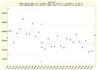
When there is a question about data, we tend to go to the application that stored the data to ask the question. But is the spreadsheet or database that houses the data the best tool for quality analysis? If you’ve ever had the unfortunate experience of creating a control chart from scratch in Excel, you understand what it’s like to dig a ditch with a spoon. Twenty-seven steps later, a basic weekly X-bar chart of accounts receivable is created.And then the CEO asks, “What does that weekly chart look like by month?” Or worse, he suggests, “Perhaps we should recalculate control limits beginning with the month we hired the collections officer.”
Want to create control charts in Oracle? This task will make 27 steps seems simple. It is better to use the right tool for the job. In this case, use a tool that has a quality mindset and understands quality management tools.
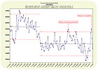
A control chart of weekly accounts receivable with two sets of control limits from data in Excel. Source: PQ Systems
Trap #3: Do Nothing
Given the work and potential hazards associated with the first two traps, one may be tempted to select another improvement project-one that is associated with the quality domain, where data already exists in the quality software programs. But in most organizations today, large amounts of data flow into databases. Operators enter data into a manufacturing program, bookkeepers into an accounting system, sales people into an order entry system.What can be learned from that data? How can the data be used to save money or improve quality in the organization? Can signals be found in the data-signals that indicate there is a problem or an opportunity? After all, why have all this data if an organization does not plan to benefit from it?
Doing nothing means gaining nothing. Control charts are simple but powerful tools. They can help avoid two important mistakes: adjusting a process when it should be left alone, and not adjusting a process when intervention could probably help. The database is a repository and the chart is a tool that allows one to make sense of the current data to bring about data-based decisions and improvements.
If one is trained in quality, he is trained to focus on reducing variation. He looks for reasons behind the variation. He looks for patterns in the data, signals that can show the way to cost savings or quality improvement. A set of analysis tools includes control charts, histograms, scatter diagrams, run charts, trend lines and Pareto charts to help analyze various sets of data.
This mindset is primarily applied in the quality domain. However, as most Six Sigma professionals have learned, these tools are valuable outside of the quality domain. Whether managing inventory levels in a manufacturing setting or keeping track of medical supplies in a hospital, quality analysis tools can enhance the decision-making process.
So data is flowing into many domain-specific applications such as a laboratory information system or patient management program. All of that valuable data is essentially locked up, but think about the potential. What if the data could be unlocked by a quality improvement software application?
A control chart of weekly accounts receivable created in 27 steps using Excel. Source: PQ Systems
Data as a Free Agent
Customers often talk about moving the data into their quality applications. Some software features ease this work, but there is another option.It would be better to understand the data in place. The data storage problem has already been solved, so customers may look for an easy way to understand this data from the quality improvement and Six Sigma point of view without getting tangled up in the mechanics of moving it around.
Software focuses on understanding data in place, the variation, the out-of-control signals, the capability indices and other statistics, all without moving the data. Quality and Six Sigma professionals are trained to look at data this way. Software can provide a tool to help accomplish this work.
The software workflow consists of defining a chart that links to data in some existing application. The link can be live and is always current. Each time the chart is viewed the most current data is retrieved. This allows one to define a chart once but use it often.
This eliminates the three problems associated with Trap #1, moving the data:
1) The data being analyzed is the original data. If data is added or changed, the software chart reflects the change. Charts are always up-to-date.
2) It eliminates repetitive work, and this in turn eliminates opportunity for errors.
3) It is flexible. Variables can be added to the analysis and data can be filtered or stratified with a few clicks of the mouse. Rework is eliminated, having a positive impact on the bottom line.
The right software can allow quality professionals to look at data from any part of the organization from a quality perspective with little or no effort. The data can reside virtually anywhere.
Just point the software to the Excel, Access, Oracle, .txt, or other file, select the type of analysis, and select chart.
Each time the chart is drawn, it will fetch the data, so that the charts are always current. It is that simple. And what about the CEO who wanted to see the accounts receivable chart by month rather than week? That’s now easily accomplished within a matter of seconds. Q
Quality Online
For more information on software, visit www.qualitymag.com to read these articles and find the latest in quality software applications and products:- “How to Manage Quality Data Across a Global Enterprise”
- “The Year of the Recall”
- The Quality Magazine Software Selector Guide
Tech Tips
Looking for a reprint of this article?
From high-res PDFs to custom plaques, order your copy today!


