Seven Key Resources for SPC
The American Society for Quality (ASQ), along with many other organizations, define statistical process control (SPC) as the use of statistical techniques to control a process or production method. These organizations further define SPC tools and procedures that can help monitor process behavior, discover issues in internal systems, and find solutions for production issues.
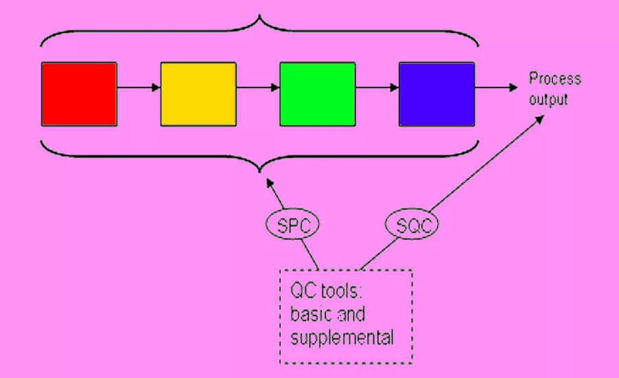
Often synonymous with statistical quality control (SQC)—the only difference noted is SQC’s inclusion of acceptance sampling—both have fourteen statistical and analytical resources or tools to control the manufacturing process. SQC attempts to control the outputs of the process, while SPC attempts to control the inputs.
Of the fourteen, seven are considered supplemental, or 7-SUPP, tools. The other seven are foundational quality-control tools, or 7-QC, and were first put together by Dr. Kaoru Ishikawa in 1974.
Cause-and-Effect Diagram
The cause-and-effect diagram, called a fishbone diagram because it resembles the skeleton of a fish, “identifies many possible causes for an effect or problem. It can be used to structure a brainstorming session. It immediately sorts ideas into useful categories.”
In fact, it is recommended that a fishbone diagram be used when trying to identify root causes or simply when a team might “fall into a rut” in thinking of improvements or solutions for a process. The procedure for executing a fishbone diagram are so focused on brainstorming that the only real requirements are a pad and paper (or whiteboard) and asking simple who, what, and why questions about a problem that is incurred.
The result is a visual tool that maps all of the potential causes and sub-causes of a defect in the process.
Check Sheet
A check sheet, or defect concentration diagram, “is a structured, prepared form for collecting and analyzing data. This is a generic data collection and analysis tool that can be adapted for a wide variety of purposes.”
A check sheet is perfect for the manufacturing process as it functions best when collecting data and observations from a repeated process conducted by the same person or machine in the same location of the process. In essence, the repetition creates patterns, making it easy to observe variations from the pattern over time. Simply deciding a timeframe and the events to be monitored results in a simple XY chart where the specific event can be “checked off” by the observer. You know have a viable, accurate check sheet for monitoring and detecting possible defects in a process.
Control Chart
The control chart can be traced back to the creation of SPC by Walter A. Shewhart and is often referred to as the Shewhart chart.
The control chart is described by ASQ as:
A graph used to study how a process changes over time. Data are plotted in time order. A control chart always has a central line for the average, an upper line for the upper control limit, and a lower line for the lower control limit. These lines are determined from historical data. By comparing current data to these lines, you can draw conclusions about whether the process variation is consistent (in control) or is unpredictable (out of control, affected by special causes of variation). This versatile data collection and analysis tool can be used by a variety of industries.
Control charts for variable data are used in pairs. The top chart monitors the average, or the centering of the distribution of data from the process. The bottom chart monitors the range, or the width of the distribution. If your data were shots in target practice, the average is where the shots are clustering, and the range is how tightly they are clustered. Control charts for attribute data are used singly.
Histogram
Quite simply, a histogram “shows how often each different value in a set of data occurs. A histogram is the most commonly used graph to show frequency distributions. It looks very much like a bar chart.”
It can be an effective tool for determining what output looks like—is it normal? How does it compare from one time period to another or more? Has output changed? The shape of the distribution on a histogram can be insightful as well.
For instance:
Normal Distribution
A common pattern is the bell-shaped curve known as the "normal distribution." In a normal or "typical" distribution, points are as likely to occur on one side of the average as on the other. Note that other distributions look similar to the normal distribution. Statistical calculations must be used to prove a normal distribution.
It's important to note that "normal" refers to the typical distribution for a particular process. For example, many processes have a natural limit on one side and will produce skewed distributions. This is normal—meaning typical—for those processes, even if the distribution isn’t considered "normal."
Skewed Distribution
The skewed distribution is asymmetrical because a natural limit prevents outcomes on one side. The distribution’s peak is off center toward the limit and a tail stretches away from it. For example, a distribution of analyses of a very pure product would be skewed, because the product cannot be more than 100 percent pure. Other examples of natural limits are holes that cannot be smaller than the diameter of the drill bit or call-handling times that cannot be less than zero. These distributions are called right- or left-skewed according to the direction of the tail.
Double-Peaked or Bimodal
The bimodal distribution looks like the back of a two-humped camel. The outcomes of two processes with different distributions are combined in one set of data. For example, a distribution of production data from a two-shift operation might be bimodal, if each shift produces a different distribution of results. Stratification often reveals this problem.
Pareto Chart
A Pareto chart is another bar graph.
The lengths of the bars represent frequency or cost (time or money), and are arranged with longest bars on the left and the shortest to the right. In this way, the chart visually depicts which situations are more significant.
Scatter Diagram
The scatter diagram graphs pairs of numerical data, with one variable on each axis, to look for a relationship between them. If the variables are correlated, the points will fall along a line or curve. The better the correlation, the tighter the points will hug the line.
Stratification
Stratification is defined as the act of sorting data, people, and objects into distinct groups or layers. It is a technique used in combination with other data analysis tools. When data from a variety of sources or categories have been lumped together, the meaning of the data can be difficult to see. This data collection and analysis technique separates the data so that patterns can be seen.
Looking for a reprint of this article?
From high-res PDFs to custom plaques, order your copy today!


