Quality Remix: VOC and VOP Loops Explained
Both the Voice of the Customer (VOC) and Voice of the Process (VOP) have an important role in evaluating our systems and processes.
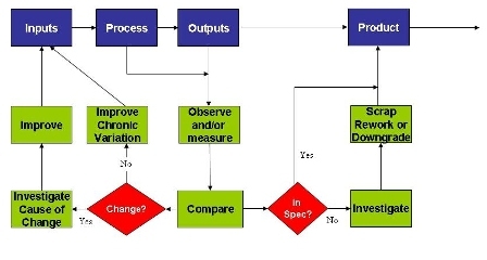
In a recent post I described the difference between the Voice of the Customer (VOC) and the Voice of the Process (VOP). I used a simple Input => Process => Output diagram to explain that both the VOC and VOP have an important role in evaluating our systems and processes.
 I said that it isn’t a case of one being right and the other wrong, or one being better or worse than the other. Both approaches have their place. But they are different.
It seems to me that the biggest issue comes when we confuse the two approaches.
I suspect someone is confusing the two approaches when they point to a control chart with subgrouped data plotted on it and say something like:
“When I see a point out near our control limits, then I know we’re getting close to going out of spec.”
On the surface this seems like a reasonable thing to say. And it must be reasonable because I hear it so often. So why do I get all worked up when I hear it?
“When I see a point out near our limits…”
The issue is that the point is the average of the data in a subgroup.
Let's look at a picture:
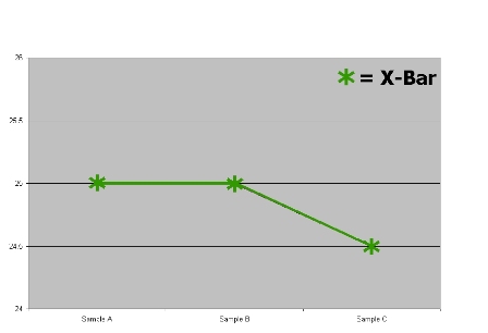 We’re looking at three subgroups of data.
What is your vote?
Specs are 25 plus or minus 5, we have no problem, right?
Specs are 25 plus or minus 1, we should worry, right?
The best answer? You don’t know.
You don’t know because these are plots of averages. (Of course if we had a range chart with this we’d know more, but we don’t. I left it out because the people who say “When I see a point out near the limits…” seem to ignore the range chart.)
Here is the actual data:
Sample A:
· Piece 1 = 24.9
· Piece 2 = 25.0
· Piece 3 = 25.1
Sample B:
· Piece 1 = 20.0
· Piece 2 = 25.0
· Piece 3 = 30.0
Sample C:
· Piece 1 = 20.0
· Piece 2 = 20.5
· Piece 3 = 33.0
And here is what it looks like plotted on the same run chart:
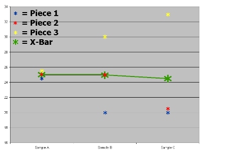 Plotting subgroup averages on an X-Bar chart and then comparing those average points against the specifications is misleading. You’re blurring the use of VOC and the VOP. Don’t stop using either loop - but don’t try to use them at the same time.
Have you ever seen the VOC and VOP loops confused? What issues has it raised for you?
In a recent post I described the difference between the Voice of the Customer (VOC) and the Voice of the Process (VOP). I used a simple Input => Process => Output diagram to explain that both the VOC and VOP have an important role in evaluating our systems and processes.
It seems to me that the biggest issue comes when we confuse the two approaches.
I suspect someone is confusing the two approaches when they point to a control chart with subgrouped data plotted on it and say something like:
“When I see a point out near our control limits, then I know we’re getting close to going out of spec.”
On the surface this seems like a reasonable thing to say. And it must be reasonable because I hear it so often. So why do I get all worked up when I hear it?
“When I see a point out near our limits…”
The issue is that the point is the average of the data in a subgroup.
Let's look at a picture:
What is your vote?
Specs are 25 plus or minus 5, we have no problem, right?
Specs are 25 plus or minus 1, we should worry, right?
The best answer? You don’t know.
You don’t know because these are plots of averages. (Of course if we had a range chart with this we’d know more, but we don’t. I left it out because the people who say “When I see a point out near the limits…” seem to ignore the range chart.)
Here is the actual data:
Sample A:
· Piece 1 = 24.9
· Piece 2 = 25.0
· Piece 3 = 25.1
Sample B:
· Piece 1 = 20.0
· Piece 2 = 25.0
· Piece 3 = 30.0
Sample C:
· Piece 1 = 20.0
· Piece 2 = 20.5
· Piece 3 = 33.0
And here is what it looks like plotted on the same run chart:
Have you ever seen the VOC and VOP loops confused? What issues has it raised for you?