An R&R Study
In most situations, you're likely to be surprised by the amount of R&R error detected.
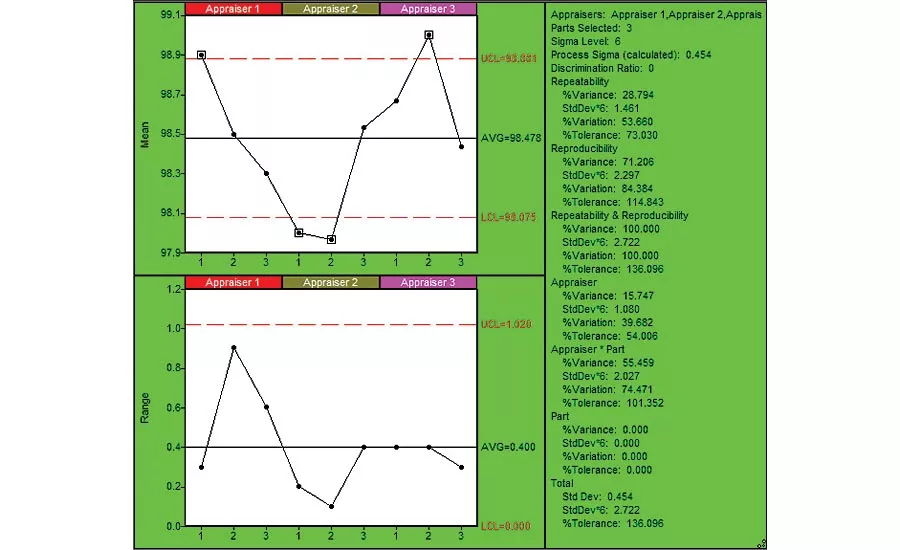
Figure 1: Repeatability Chart (using SPC IV Excel by Quality America (by permission)
For most processes, we have a choice of measurement options that vary with cost. Ideally, we seek the most accurate measurement at the lowest cost with the expectation that the result will be satisfactory. When measurements are critical to operations, we should validate these assumptions.
We might measure a quantity that is not critical to our operations but is easy to measure to serve as a proxy for a parameter of interest. For example, a bottle filling station may be concerned with fill volume, but measure weight since it’s easier.
Process measurements that provide a leading indicator, before an undesirable outcome is attained, are preferred. To estimate the spread of the coronavirus, Kinsa Health says their million or so internet-connected thermometers are providing up to 162,000 useful data points per day of fever measurements, enabling them to track the spread of the virus across various regions, days before these patients visit urgent care (New York Times, March 30, 2020 (updated April 6, 2020)). The company cites several regional examples of fever trends, both upward and downward, that correspond well to reported local infection rates which lag the fever data by five to ten days. The data detected minimal impact from declaring a state of emergency and limiting mass gatherings in New York, for example, but showed a marked effect
of closing schools, bars
and restaurants.
Using temperature readings as a proxy for more definitive testing sounds encouraging: Companies might use this simple measurement, with immediate feedback, to check employees at the gate (or patrons at the restaurant door) to weed out those that have a measurable fever as possible virus carriers. This isn’t perfect by any means, as it’s been claimed that many carriers who can transmit the virus do not yet (or may never) have a measurable fever. Likewise, a person may have a fever unrelated to the virus.
With my three sons (yes, I loved that show as a kid) home from school, I thought I’d put them to work in a real-world experiment: an R&R (Repeatability & Reproducibility) study to estimate measurement variation using a temporal artery thermometer, usually available for less than $30 (but good luck finding one now).
In an R&R Study, we want to include all the typical sources of variation experienced in the measurement process. First, we established that we had a defined measurement process. Fortunately for us, that was largely provided by the label on the device, so I made sure we were all familiar with that. In a production setting, I might skip that step in an initial R&R study, as the operators were expected to be trained in that procedure and I’d want to quantify the “as-is” level of measurement system performance. Unlike a calibration study to estimate accuracy, we would also use actual production pieces, just as an operator would measure them, to include the effects of the within piece variation.
In our test, we had three appraisers, each sampling three items (i.e. patients) three times. (I let my youngest son, 11, off with being a mere patient, and no one sampled their own temperature, resulting in 27 measurements total.) We randomized the trials amongst all appraisers and patients, so that if there were a trend, it would not be incorrectly attributed to a patient or an appraiser. (After collecting the data, I used a Moving Range control chart of the data in the order they were measured to verify no special causes or trends were present.)
Figure 1 provides a classic Repeatability chart of the data, with summarized information in the right margin. To interpret the chart, we start with the bottom chart, plotting the range between appraiser trials of each patient, grouped by appraiser. The chart shows the range is in control, meaning the repeatability error is consistent across the three appraisers and three patients. The summary in the right pane indicates that Repeatability error is about 54% of total variation, which isn’t very good. (A reasonable rule of thumb is 10% or less.) Using a process requirement of +/- 1 degree, 73% of that permitted variation is consumed by repeatability error.
The top chart plots the average of the three trials for each patient. It shows four out of control groups. On this chart, we’d like to see “most” (i.e. more than half) of the groups outside the control limits. The reasoning is as follows: The control limits on the top chart reflect the repeatability error (tighter limits=smaller repeatability error). The variation between the plotted subgroups (patients in our case) is the process variation we’d like to detect, so many out of control groups tells us the repeatability error is small enough to detect the process variation observed.
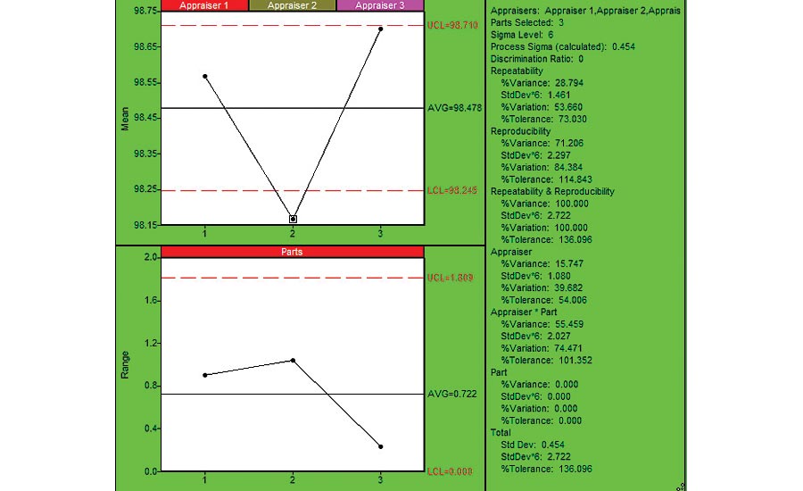
Figure 2: Reproducibility Chart (using SPC IV Excel by Quality America (by permission)
Figure 2 provides a Reproducibility chart. The bottom chart shows the range of measurements for each patient. It is in control, so no patient is significantly different from the other patients. Sometimes you’ll see one of the parts is significantly different from others, which might lead to a better understanding of the measurement variation due to within piece variation. The top charts show the reproducibility between the different appraisers: The average of the Appraiser 2 data is significantly less than observed for appraisers 1 and 3. This might represent an opportunity for reducing the overall measurement variation. The summary statistics indicate that Reproducibility error is 84% of the total variation, and 115% of the process requirement, so larger than estimated for Repeatability. The breakdown provided by the Appraiser and Appraiser*Part interaction, using the ANOVA method, indicates that most of this variation is wrapped in the Appraiser*Part interaction. That is, there are significant differences between appraiser measurements for the same patients. Further insight can be attained by charting the data in Figure 1 on a per-appraiser basis, as shown in Figure 3. Here we see that Appraiser 1 had much higher levels of variation (above 2x more) than Appraiser 2 or 3. If we noticed specific techniques that differed between the appraisers, we could use that to improve the measurement system.
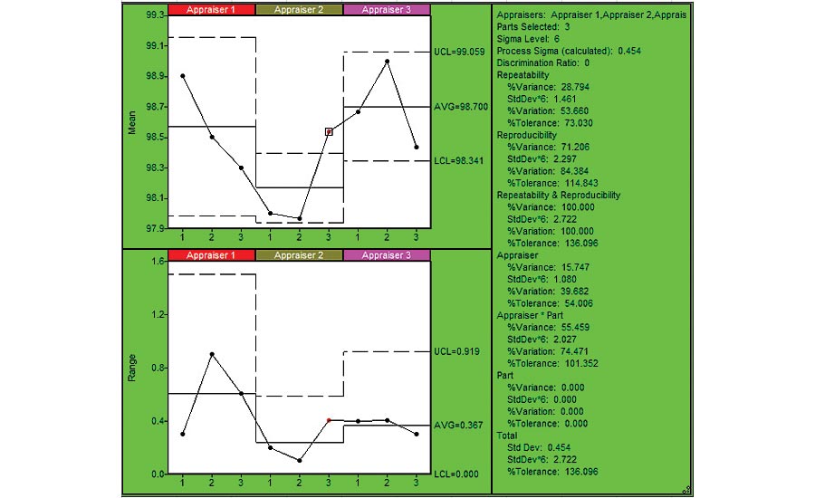
Figure 3: Repeatability Chart by Appraiser (using SPC IV Excel by Quality America (by permission)
In most situations, you’re likely to be surprised by the amount of R&R error detected, leading to an improved system. We could further analyze this measurement system with an accuracy study, which compares readings with those obtained using equipment or methods of a higher precision. For body temperature, that’s usually the rectal thermometer, but I had no volunteers for that study. Q
Looking for a reprint of this article?
From high-res PDFs to custom plaques, order your copy today!


