Brain Teasers: Are Sales Decreasing?
Anyone who has faced a production problem with a need to solve it by using production data can relate to the notion of a brain teaser. The brain teasers presented here are based on real-world situations encountered by workers in manufacturing environments. The brain teasers have three parts: (1) the situation, (2) available data or other supporting information, and (3) questions that various workers need answered for continual improvement. Recommended solutions follow in the next issue and on the Web at Quality Online (www.qualitymag.com).
Situation
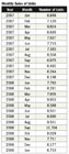
On a recent monthly report Roxanne, the production manager for a company that manufactures mobile technology equipment, noticed that the total number of units sold in January 2009 was lower than the total number of units sold in both January 2008 and January 2007. She then started looking at other months and discovered that the number of units sold in December 2008 was the lowest value for the entire time period. At the next monthly production meeting, Roxanne expressed her concern that company sales were beginning to decline and decisions about staffing needed to be made soon.Available Data
The monthly sales data for units sold are printed on production reports. Roxanne asked for a special printout of all months in 2007 and 2008. These data appear in the table, “Monthly Sales of Units.”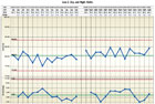
Questions
1. Based on the data from January 2007 through January 2009, what evidence exists that sales are beginning to decline?2. Using an individuals and moving range chart with all of the data, what is the behavior of these data on number of units sold? What is the routine variation month-to-month for these data?
3. How do 2007 and 2008 sales compare? What should Roxanne expect for monthly sales of units in 2009?
4. What, if any, actions should Roxanne propose concerning monthly sales?
Answers to April Brain Teaser
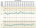
Keith is the production manager at a motor plant. He has been asked to provide process behavior information at the morning meeting instead of the summaries currently used. Because the current summaries are preprinted, setting up charts for the data will take some time. Keith asked LaShawn, a production supervisor, to set up the charts to analyze yield of all stator production process lines.Q: La Shawn decided to analyze all stator lines together. He set up an average and range chart with a subgroup of size 6. What is your interpretation of process behavior with this setup? What are the sources of variation in the ranges?
A: Using an average and range chart with a subgroup size of 6, the process behavior appears to be predictable at a grand average of 86% (85.97%) and a standard deviation of 5.4% calculated from the average range. Using these results, LaShawn explains to Keith that the natural process limits for yield from the stator lines are 70% to 100% due to routine variation only. In this analysis, the subgroup ranges include equipment, material, operator, procedure and measurement variations plus differences in lines and shifts, all of which will make up the sources of routine variation. See the chart, “Stator Production Yield.”
Q: After he made the first chart, LaShawn decided to analyze each line separately. He set up an individuals and moving range chart for each line by plotting all 14 day shift values and then all 14 night shift values. What does this organization of the data reveal?
A: With separate individuals and moving range charts for each line, LaShawn can determine if all stator lines have the same average and standard deviation and if they all have predictable behavior. For Line 1, night shift has a long run about the overall average line indicating that night shift yield is higher than day shift. The average for Line 2 is 80.6% with no detectable difference between the day and night shifts. Also, for Line 3 the overall average is 90% with no detectable difference between the two shifts. The two shifts on each line have about the same amount of variation (see the range chart for each line), but it appears that Line 1 has a greater amount of variation than the other two lines. See the chart, “Line 2, Day and Night Shifts.”
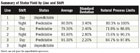
Q: The third charting approach LaShawn used was to plot each line and shift separately. He had six individuals and moving range charts. What do you learn from these charts?
A: From these six charts it is possible to compare lines and shifts to determine where any differences might be found. A summary of these six charts is in the table, “Summary of Stator Yield by Line and Shift.”
Q: What other ways might LaShawn have charted these data to understand process behavior? In order to have all stator processes achieve the same yield at the highest level, which charting approach gives the best insight about the stator processes and the challenges that Keith faces?
A: The behavior of any process is best understood with data plotted in time order. Some insights surface when data are plotted by shift and/or by line. However, the goal is to achieve predictable high yields regardless of the line or shift. To monitor this goal, Keith needs to have process behavior charts for each line separately with day and night shifts occurring in time order instead of displaying the shifts on separate charts. By plotting shifts separately, some patterns that indicate process changes will be missed.
Looking for a reprint of this article?
From high-res PDFs to custom plaques, order your copy today!


