Software
Smart Performance Charts (SPC)
What if we changed the name of these charts?

Have you ever tried to explain control charts to a worker or a CEO who has never seen one before? It’s not easy, is it? What if it could be?
Over my 30 years in quality, I’ve had to learn a slew of other jargon such as “Six Sigma (complicated),” but none more death-defying than Statistical (ugh!) Process (boring) Control (hey, I hate control).
Words matter. Let’s face it, Shewhart did us no favors when his obsession with controlling manufactured quality spilled over into naming his creation “control charts.” Despite their usability in endless applications, after almost 100 years, few people know how to use them, let alone use them effectively.
Dr. Donald Wheeler has been using the phrase “process behavior charts” to describe control charts. Again, process and behavior are both boring words. Not very sticky. Lloyd Provost calls them “Shewhart Charts” (who the heck is Shewhart and why should I care?) If they were called Springsteen charts, they might have a chance.
In an age when everyone has a smart device tracking their performance (e.g., steps per day or heart rate), why are people so turned off by SPC? I’d like you to consider that the language of quality is off-putting. Jargon, in general, is off-putting.
Just as Mikel Harry launched a new phrase (Six Sigma) to replace TQM (Total Quality Management) which replaced quality circles and so on, it’s time to rename our methods and tools in a way that will make them more accessible, more desirable. Consider SPC.
Smart Performance Charts (SPC)
What if we changed the name of these charts? First, let’s call them smart (who doesn’t want to be smart), because these charts went to college and took statistics. The statistics in these charts help us detect anomalies in performance, much as a smart watch can detect atrial fibrillation. You don’t have to be a cardiologist to use a smart watch to detect heart problems. You just have to wear the watch.
Modern SPC software makes it easy to draw these charts, so that users don’t have to learn statistics. Let’s not pretend that everyone has to learn the formulas just because we had to learn how to do this manually in the last century. Nonsense. There’s an app for that. Buy one. Start using it.
Next, let’s use the word “performance,” because everyone wants to improve their performance. Once you start keeping score, everyone will want to improve their performance. It’s human nature.
And finally, it’s still a chart, just a smart performance chart.
Unfortunately, most people are still using Excel line or bar charts. These charts are not that smart. They can’t tell you if a process is stable and predictable, or unstable and unpredictable. They can’t differentiate between signal and noise, between special causes and common causes, but smart performance charts can. Fluctuations in line and bar charts often send businesspeople off on wild goose chases to determine why a key performance indicator (KPI) is up or down. If the process is stable, this is a total waste of time, but companies around the world waste millions of hours every year chasing phantoms in their data.
They wouldn’t waste all this time if they used smart performance charts instead.
Control Charts for Stability Analysis
There are many kinds of control charts, but it can be easy to figure out which you need. They can be used on the factory floor or in backroom functions such as accounting, purchasing, scheduling, etc.
If your data is an integer (e.g., 1,2,3) then you will most likely need a c, np, p or u chart.
If your data has a decimal point (e.g., 33.5), then you can use an XmR/ImR, XbarR,or XbarS chart. Sometimes integers hide the decimal point such as dollars, hours, days, etc. Again, use an X chart.
The Automotive Industry Action Group (AIAG) has sample data in their SPC manual (2nd) for each type of chart. Let’s look at the most common ones.
XmR/ImR Chart of Acid Concentration (Figure 1) – A single column of decimal data. Out of control points are shown in red. Special cause analysis will determine the source of these issues. Dr. Donald Wheeler calls the XmR chart the “Swiss Army Knife” of control charts. It’s widely used in service industries and the service part of manufacturing.

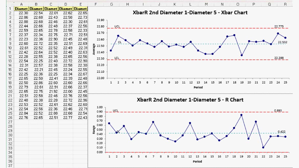
XbarR/XbarS of Piston Diameters (5 samples per subgroup, Figure 2) - Stable Process
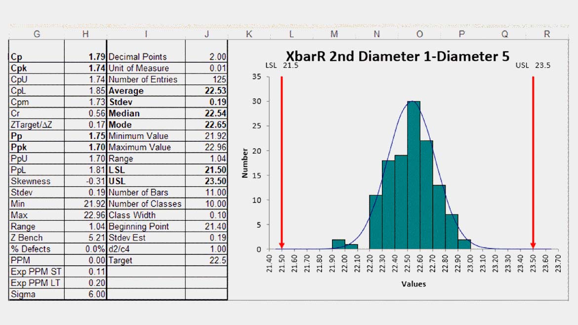
Capability Analysis of Piston Diameters using Histogram (Figure 3) – USL=23.5 and LSL=21.5
Cp and Cpk are greater than 1.66 (five sigma). Minimum Cp and Cpk is often 1.33 for manufacturing.
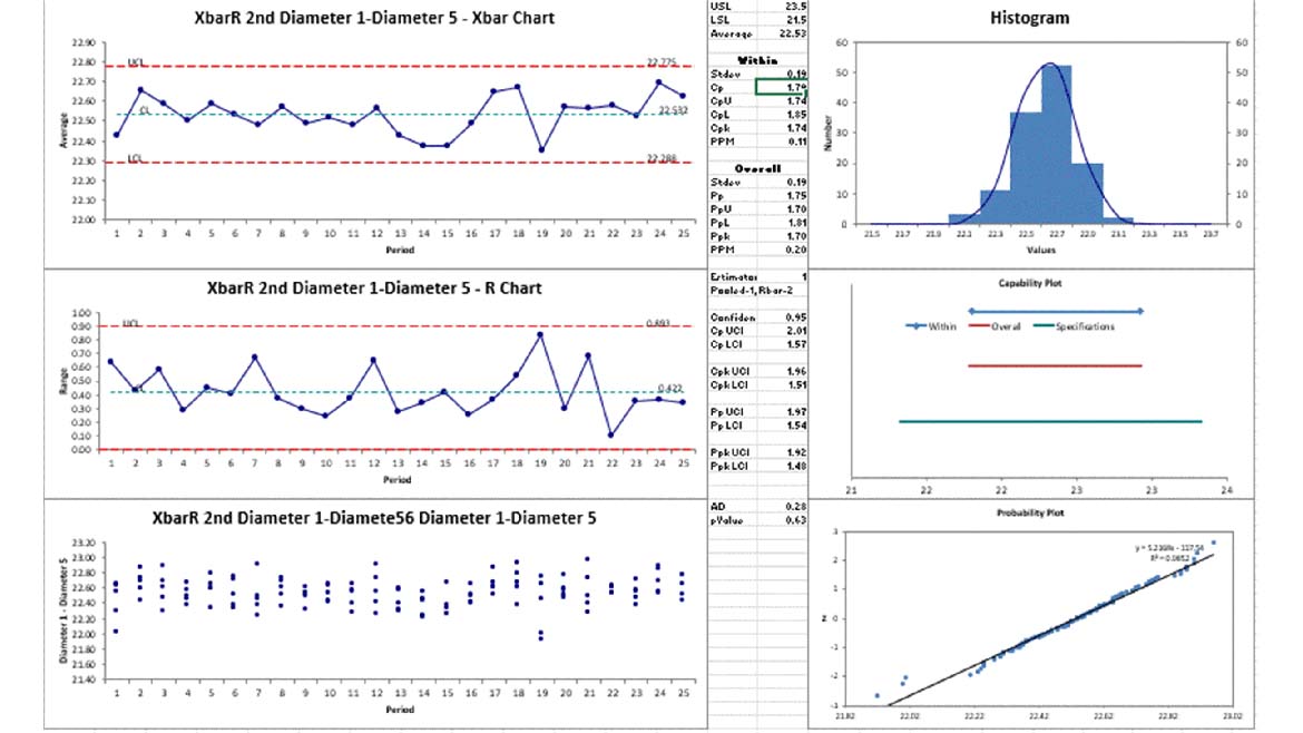
Capability Analysis of Piston Diameters using Capability Suite (Figure 4)
It is possible to do both stability and capability analysis with one group of charts. This capability suite shows Xbar charts, values plot, histogram, capability plot and normal probability plot (data is normal). It also calculates the same Cp and Cpk.
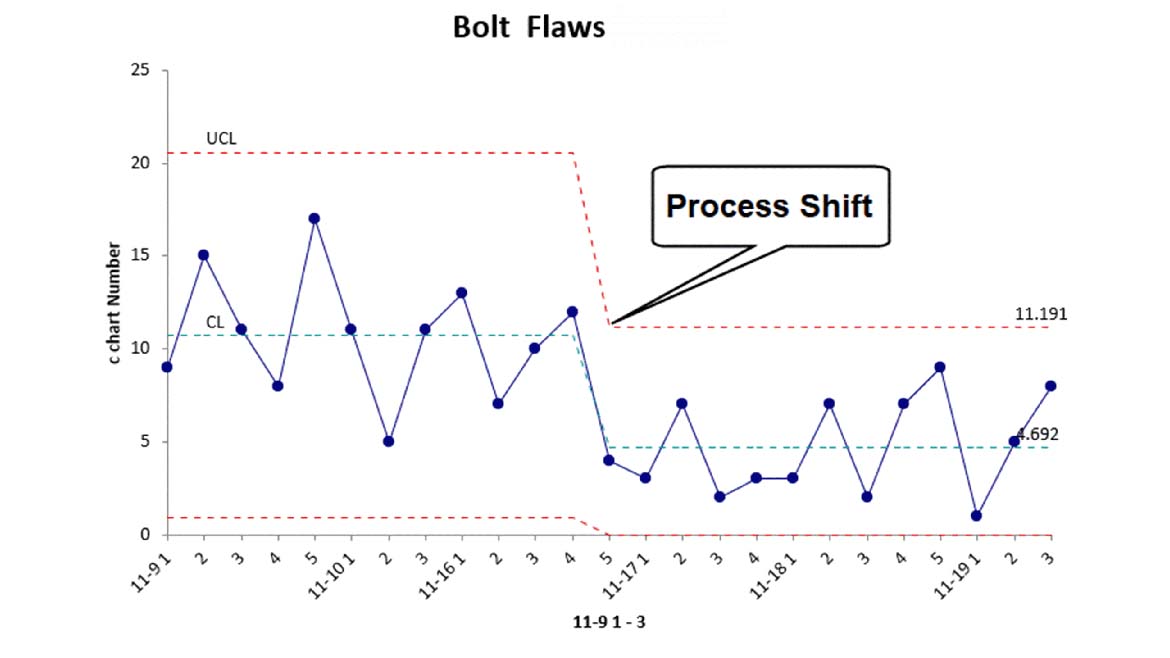
C Chart (pg. 96) – Bolt Flaws Showing Process Shift (Figure 5)
P Chart – Non-Conforming Units per Sample showing variable limits (Figure 6)
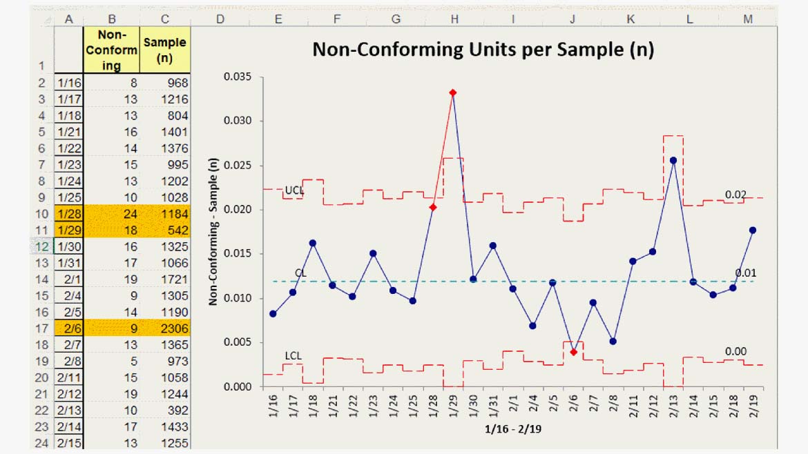
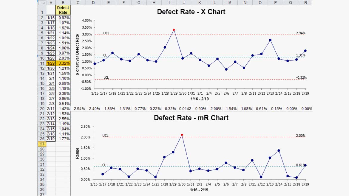
Note: This data can be converted into a percentage and plotted as an XmR chart (Figure 7).
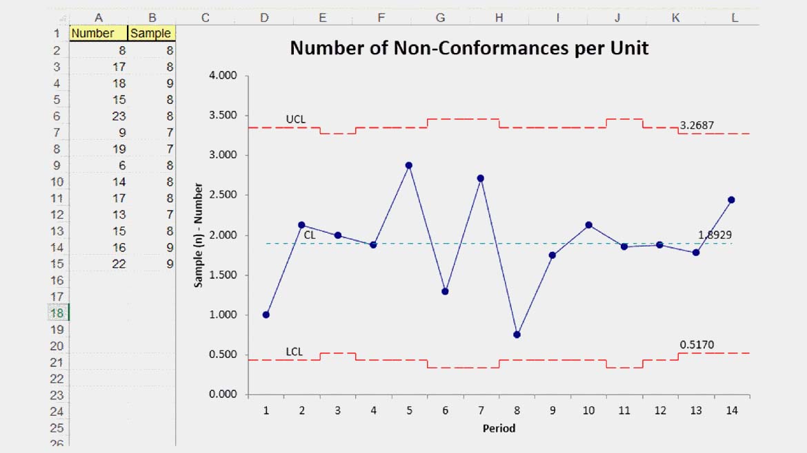
U Chart (pg. 94) - Number of Non-Conformances per Unit (Figure 8)
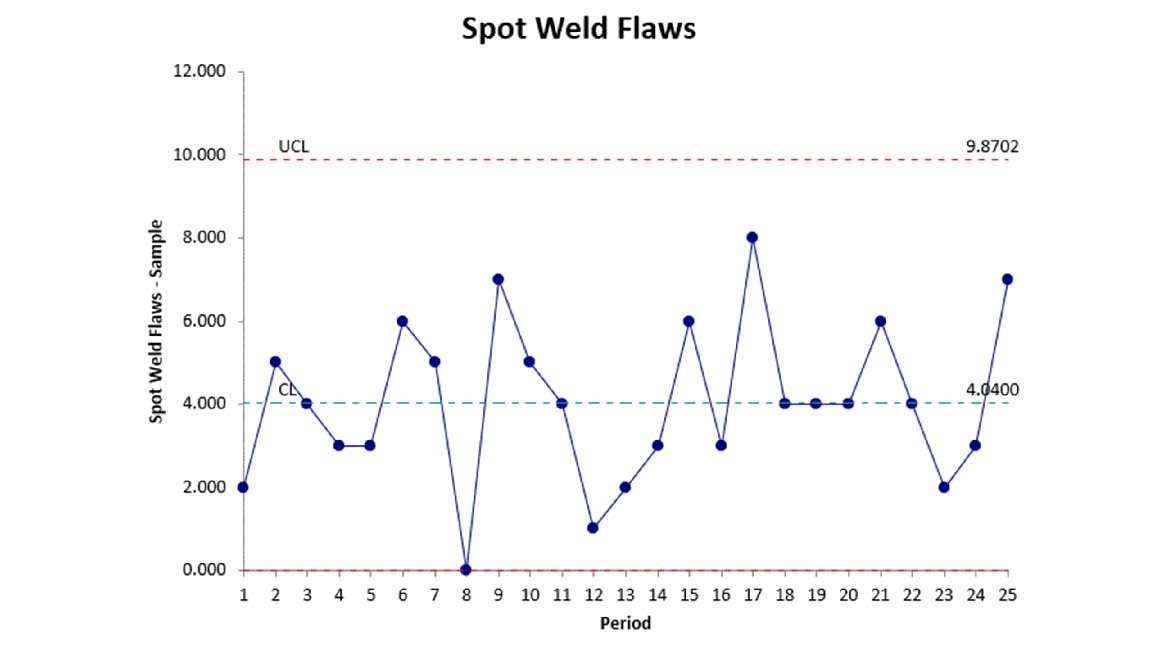
Np Chart (pg. 92) – Spot Weld Flaws (Figure 9)
Since SPC software will do the heavy lifting and statistics, all one needs to know is the desired outcome for smart performance charts. There are two key things to achieve:
Reduce variation (tighten up the limits) – Figure 10.

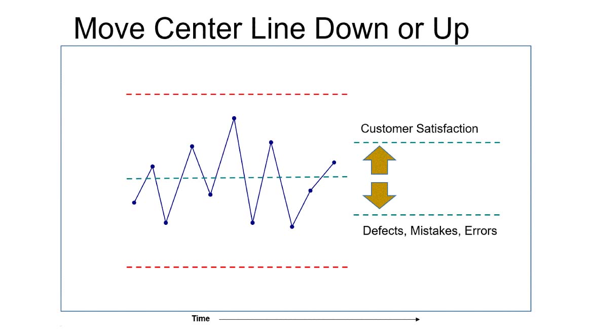
Move the center line up or down to increase satisfaction or reduce defects (Figure 11).
Gone are the days of using gut feel, common sense and trial-and-error to guide and sustain improvements which often do more harm than good. Smart performance charts can help dramatically improve the performance of any business process—manufacturing or service.
Conclusion
Gone are the days when we could force people to spend weeks in training to learn complex methods, tools, manual calculation of formulas and jargon to engage in performance improvement. In the interest of spreading the gospel of quality, let’s consider renaming our methods and tools to make them more desirable and sticky.
We all stand on the shoulders of giants, but they are gone now. It’s time to stand on our own two feet.
Statistical Process Control - SPC Second Edition, AIAG, 2005.
Looking for a reprint of this article?
From high-res PDFs to custom plaques, order your copy today!


