How to Statistically Control the Process
When disruptions are detected, it’s critical that operators have the tools available to quickly diagnose and correct the issues.

Figure 1. Stratifying by source, such as shown here, makes it easy to identify the potential cause of the process shift when relevant traceability data is included.
Statistical process control (SPC) charts are used in quality-focused facilities to monitor process output on a continual basis and alert process operators, managers and the support staff in real-time when the process is shifting towards an undesirable condition. This rapid response provides a cost-effective approach to defect detection, and many cases defect prevention, to keep orders on-time and within cost estimates. SPC charts are essential tools for implementing lean just-in-time, since low or no inventory requires the predictability that a capable, statistically controlled process can reliably deliver.
When disruptions are detected in the process, it’s critical that process operators have the tools available to them to quickly diagnose and correct the issues. Most SPC software has features built-in to accommodate these needs, so it’s not surprising that the paper-based systems of the past have been replaced by modern, almost futuristic systems that can monitor the process with minimal input needed from process operators. Data can be electronically submitted via serial ports or seamlessly linked from coordinate measurement machines (CMM) or other measurement systems.
Troubleshooting procedures, drawings and recommendations can be version-controlled and directly linked to the monitoring charts so they are quickly available for review when needed. Likewise, when support personnel such as process supervisors or manufacturing engineers are automatically alerted via email or text messages, they can provide real-time hands-on problem solving. Yet, diagnosing special causes is often not trivial, and sometimes requires more information.
One quick source of information for troubleshooting is data stratification. Usually, data entry includes not just the measurement data but one or more traceability fields associated with each data value. These can include items such as the current manufacturing order number, as well as traceability back to the supplier, such as supplier lot number. Stratifying by source, such as shown in Figure 1, makes it easy to identify the potential cause of the process shift when relevant traceability data is included. In this case, the Supplier Lot PY167, represented by the blue circles, is coincident with the process shift. Returning to use of the earlier Supplier Lot F182, represented by the green squares, coincides with the return of the process to its original operating level, suggesting the influence of a deviant supplier lot.
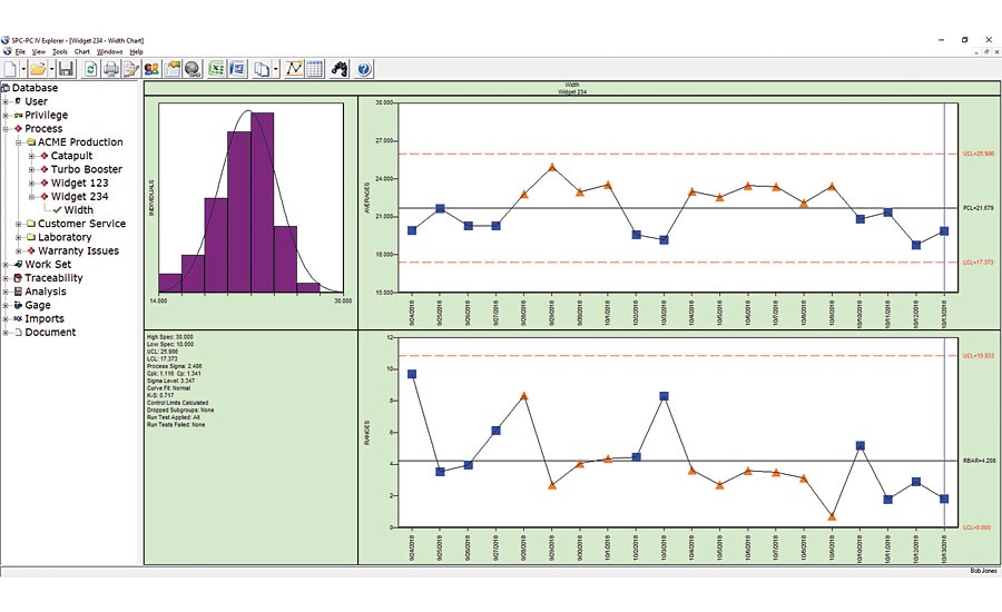
Figure 2. In analyzing the process data in Figure 2, the process personnel realized the chart contained subgroups for two types of parts from the same part family.
Sometimes stratification effects will be more subtle and appear as the random variation between the control limits, also known as common cause variation. In analyzing the process data in Figure 2, the process personnel realized the chart contained subgroups for two types of parts from the same part family. Type C and Type D parts are similar in most details, so the quality team thought a single chart of both types would be acceptable. Sometimes that is a reasonable approach, and the chart verifies that the variation between the two types (Type C as blue squares; Type D as orange triangles) is small relative to the control limits. Curiously, the subgroups for the Type C parts were all below the process centerline, while those for Type D were above the centerline. With a couple clicks of the mouse, the analyst quickly created charts filtered by part type, and sees that the chart for Type D shows a process whose capability index Cp is 1.5 with a Cpk of 1.0, indicating that the capability of this process can be improved to 1.5 by centering the process at the midpoint of the specifications. Re-centering the process is usually one of the easier improvements, sometimes simply a matter of changing a backstop or a fixture adjustment. The Type C process shows similar levels of Cp and Cpk of 1.2, so process centering is not the issue. Instead, the overall variation of the process for Type C parts is excessive. This usually requires more involved process redesign; a designed experiment would likely be helpful to identify the process factors contributing to the excessive variation. [Note: The charts use a subgroup size of three, so a typical rule of thumb would require 50 subgroups to establish statistically valid control limits. We used less groups in this case for ease of display, although statistically valid limits based on less groups would be wider and not impact our analysis appreciably].
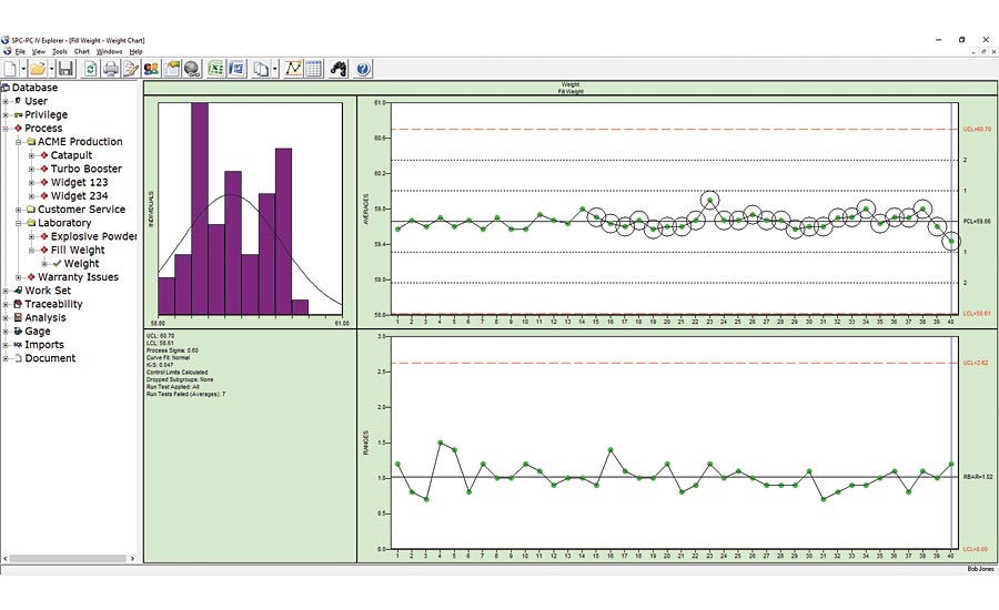
Figure 3. This data could be from a multi-head filling machine such as used in beverage or cosmetic bottling; the multiple cavities of an injection molding machine; the multiple parts placed on a magnetic chuck in a CNC grinding machine; or any number of similar processes.
In some cases, the simpler stratification techniques seen here won’t show anything that stands out because of the effect of interactions. For example, if the differences between the Type C and Type D parts were only evident when the parts were run on a specific machine, then that would indicate an interaction between the machine and the part types. Sometimes you can pick this up with a multiple regression of the process data in Excel or Minitab, in which case you’d have a suspicion about the interaction that can be confirmed with a designed experiment. Bottom line is that the more advanced tools of regression, and the simpler tools of stratification, when used to mine process data should be validated with a designed experiment.
A different type of stratification can also impact the estimate of common cause variation represented by the chart’s control limits. For the familiar X-Bar/Range chart, the control limits on the X-Bar chart are calculated using the average range within each subgroup. The control chart works because if the process is stable, then the short-term variation seen in each subgroup should be a good predictor of the longer-term variation seen from subgroup to subgroup. Figure 3 shows a control chart whose subgroups are all well within the control limits, so the process would appear at first glance to be in control. Yet, if these control limits were realistic, we should expect to see the subgroups relative position between the control limits resemble the bell-shaped curve of the normal distribution: Most (approximately 68% over the long term) within +-1 sigma (i.e. a third of the way between the centerline and the control limit on each side); a small number of groups beyond +-2 sigma (about 5% total on both sides); and the remaining groups between the 1 and 2 sigma levels.
We’ve included the zone lines on this chart so it’s clear that all the groups are within the +-1 sigma zone. Fortunately, software can easily look for these types of non-random behavior, and since this chart shows many of the groups within the small band about the centerline, these groups are flagged automatically as suspicious. The circles indicate a run test violation, notably Run Test 7: fifteen successive groups within 1 sigma of the centerline. What’s the cause of this behavior, and why is it a concern?
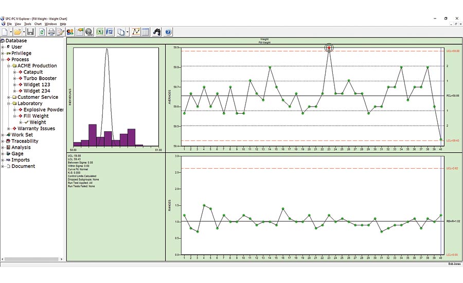
Figure 4. Figure 4 shows the batch means chart for this process data. Figures from SPC-PC IV Explorer by Quality America. Used by permission
This data in Figure 3 could be from a multi-head filling machine such as used in beverage or cosmetic bottling; the multiple cavities of an injection molding machine; the multiple parts placed on a magnetic chuck in a CNC grinding machine; or any number of similar processes. In each case, you’ve assembled your subgroup using a single sample from each stream of a multiple stream process. The control chart is not testing if the short-term variation is a good predictor of the longer-term variation but is instead testing if the variation between the multiple streams (i.e. between each head of the filling machine) is a good predictor of the variation over time. In statistical terms, we would say that is not a rational subgroup, which lies at the heart of a control chart: It is not reasonable to expect the variation between the filling heads to predict the variation over time, and the run test violations have detected that as an issue. In that case, you could look at each head individually, or alternatively use a special case version of the X-Bar chart: the batch means chart. Figure 4 shows the batch means chart for this process data. The range chart at the bottom plots the variation between the filling heads, while the averages chart at top plots the average of the heads over time. The difference from the standard X-Bar chart is that the control limits on the averages chart are calculated based on the moving range between the subgroup averages. As such, they provide a better predictor of the process variation over time, while the range chart shows if the differences between the heads are consistent over time. Q
Looking for a reprint of this article?
From high-res PDFs to custom plaques, order your copy today!


