Artificial Intelligence (AI)
AI + Spreadsheets: The Productivity Revolution You Didn’t Know You Needed
Welcome to the frontier of productivity, where artificial intelligence transforms your Excel files, Google Sheets, and CSV sheets into dynamic business decision tools.

Image Source: InfiniteFlow – stock.adobe.com
In the fast-evolving world of business technology, a revolution is happening inside one of the most familiar and unassuming tools—your spreadsheet. Once a grid of numbers and formulas, spreadsheets have been catapulted into the AI era, becoming interactive, intelligent workhorses capable of data analysis, visualization, and even decision-making, thanks to the integration of chat-based AI systems.
Welcome to the frontier of productivity, where artificial intelligence transforms your Excel files, Google Sheets, and CSV sheets into dynamic business decision tools. But with great power comes great responsibility. Let’s dive into how to unlock this game-changing potential—securely and smartly.
The Rise of AI Chat Systems
AI chat systems like ChatGPT, Google Gemini, Microsoft Copilot, and Meta AI are reshaping how professionals interact with data. Using Natural Language Processing (NLP), these systems can understand, interpret, and respond to human queries as if you were speaking to a real data analyst.
They don’t just spit out facts. They learn context, process previous conversations, and even handle multimodal inputs like images and code. For businesses, this means you can upload a spreadsheet, ask complex questions in plain English, and receive insights, summaries, and visualizations in seconds.
From Static to Smart: Why Spreadsheets and AI Are a Perfect Match
AI chat tools are especially potent when paired with spreadsheets. Why? Because spreadsheets are structured, and structured data is AI’s best friend. With clearly labeled rows and columns, AI systems can quickly parse information and deliver meaningful results—whether you’re asking for a sales trend analysis, a profitability summary, or a chart of quarterly growth.
Use cases are endless:
- Automating financial reports
- Identifying outliers in customer behavior
- Summarizing massive datasets
- Generating predictive insights
- Creating pivot tables or even VBA macros on demand
But before you get too excited and drag your entire ERP export into an AI chat window, take a moment to prepare.
Security First: Using AI Responsibly
As exciting as this new world is, there are significant risks if AI is misused, especially in corporate environments. Ask for your corporate AI policy!
Top AI Security Concerns:
- Confidentiality Leaks: AI will retain and possibly expose sensitive inputs.
- Misinformation: AI can generate outdated, inaccurate, or entirely false information—sometimes sounding very convincing.
- Deepfake Scams: Cybercriminals use AI to mimic executives’ voices or write realistic phishing emails.
- Compliance Risks: Unapproved AI use might violate GDPR, HIPAA, or internal policies.
- Malicious Code: AI-generated scripts can contain vulnerabilities or even malware.
Best Practices to Stay Safe:
- Use company-approved AI tools that comply with IT standards.
- Never input confidential data into public AI tools.
- Always fact-check AI outputs before making decisions.
- Verify suspicious requests (especially those involving money or sensitive info).
- Run security audits on AI-generated code and automation.
How to Prepare Your Spreadsheet for AI Brilliance
Here are the top strategies for setting up your spreadsheet to work with AI, not against it.
1. Protect Sensitive Data
Ask for the company AI policy! AI chat tools often store user inputs. This means any proprietary or confidential data—think employee records, customer info, financials—can be at risk.
Best Practice: Get IT’s blessing before using any AI tool with company information! Always redact or anonymize sensitive data if using a public chat. Replace real names with employee numbers or customer IDs.
2. Choose the Right Format
The file format matters. While CSV (.csv) files are best for compatibility, Excel (.xlsx) and Google Sheets also work well. Avoid outdated or complex formats including .xls or PDFs, which can confuse the AI or require manual clean-up.
3. Clean and Standardize Your Data
AI doesn’t like dirty data. Remove duplicates, fill in blanks, standardize headers (“Customer Name” instead of “CN”), and use consistent date formats like YYYY-MM-DD. Even small inconsistencies can derail an analysis.
4. Mind the File Size
Most AI systems can only handle files up to a certain size. For example, ChatGPT has a spreadsheet size limit of around 50MB, while Grok supports up to 1GB. These vary based on the subscription level.
Tip: Filter out unnecessary columns or summarize large datasets before uploading.
5. Use Clear Labels
Column headers guide AI interpretation. Labels like “Total Sales ($)” work far better than “TS$”. Avoid merged cells, nested tables, or multi-row headers, and keep one clear table per sheet.
Quick Checklist for AI Spreadsheet Setup
✅ Remove or anonymize sensitive data
✅ Use .csv or .xlsx format
✅ Clean up headers and data consistency
✅ Limit file size
✅ Use clear, short, descriptive labels
✅ One table per sheet
✅ Test with sample data before full upload
✅ Validate AI insights with manual checks
Using Prompts Like a Pro
Once your spreadsheet is ready, it's time to start the conversation with AI. But vague questions won’t get you far. Instead, think of yourself as briefing a super-intelligent intern.
Here’s How to Get the Best Results:
- Be Specific: “What is the total sales revenue by region for Q1?” works better than “Show me sales.”
- Ask for Grouping: Request breakdowns by month, product, or customer segment.
- Use Filters: Target specific data ranges (“Show sales over $10,000 only”).
- Request Charts: Ask for bar graphs, line charts, or Pareto analyses.
- Calculate Metrics: Totals, averages, profit margins—ask away.
- Spot Trends and Outliers: AI can help detect patterns you might miss.
- Export Tables: Many chat systems let you copy outputs into Excel or download tables directly.
Some sample prompts and ChatGPT outputs
Prompt: What ten sku’s have the highest total expenses?
Sample Response:
Below is the list of the ten SKUs with the highest total expenses, calculated from the Purchasing_Records_Table. This ranking is based on the summed “Total Cost ($)” per SKU, sorted in descending order.
|
SKU |
Total Expenses |
|
SKU-938226 |
308833.76 |
|
SKU-383985 |
247812.72 |
|
SKU-429031 |
229155.68 |
|
SKU-323666 |
206980.80 |
|
SKU-760700 |
199310.60 |
|
SKU-952603 |
197950.50 |
|
SKU-909123 |
188749.03 |
|
SKU-950281 |
181434.66 |
|
SKU-343614 |
178831.50 |
|
SKU-489629 |
176124.18 |
Prompt: What is the average cost of the ten sku’s from the last response?
Sample Response:
Below are two ways of looking at the average item cost for the ten SKUs with the highest total expenses from the previous list:
- Overall average item cost (all 10 SKUs combined):
$444.43 (approx.)\$444.43 \text{ (approx.)}
- Average item cost by SKU (grouped):
|
SKU |
Average Item Cost ($) |
|
SKU-323666 |
497.55 |
|
SKU-343614 |
350.65 |
|
SKU-383985 |
436.29 |
|
SKU-429031 |
437.32 |
|
SKU-489629 |
402.11 |
|
SKU-760700 |
472.30 |
|
SKU-909123 |
435.91 |
|
SKU-938226 |
468.64 |
|
SKU-950281 |
486.42 |
|
SKU-952603 |
460.35 |
Prompt: Group the total sales by customer and sort them in descending order. Show the top ten.
Sample Response:
Here are the top 10 customers based on total sales, grouped and sorted in descending order by total sales value from the Sales_Records_Table:
|
Customer Name |
Total Sales ($) |
|
Customer 155 |
140,016.76 |
|
Customer 372 |
137,073.35 |
|
Customer 39 |
135,316.85 |
|
Customer 232 |
125,670.66 |
|
Customer 265 |
115,939.78 |
|
Customer 295 |
111,845.93 |
|
Customer 349 |
105,591.15 |
|
Customer 205 |
102,640.03 |
|
Customer 362 |
101,790.43 |
|
Customer 79 |
100,592.98 |
Prompt: Create a vertical bar chart of total sales by month.
Sample Response:
Total Sales by Month
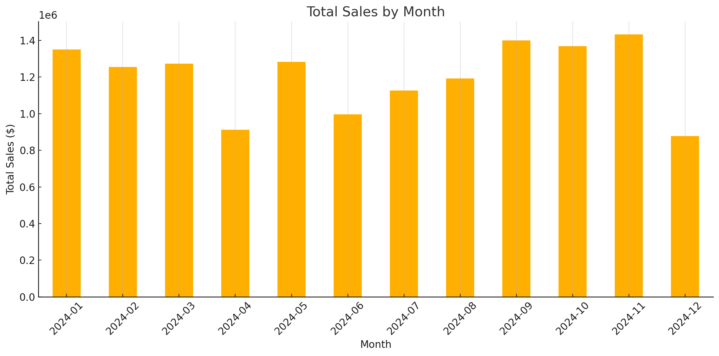
Here is the vertical bar chart displaying Total Sales by Month based on the data from the Sales_Records_Table. Each bar represents the total sales revenue for a given month. This visualization can help identify sales trends and seasonal patterns.
Let me know if you'd like this broken down further (e.g., by product category, customer type, or region).
Prompt: Generate a Pareto chart of the top 5 customers by total purchase amount.
Sample Response:
Matplotlib Chart
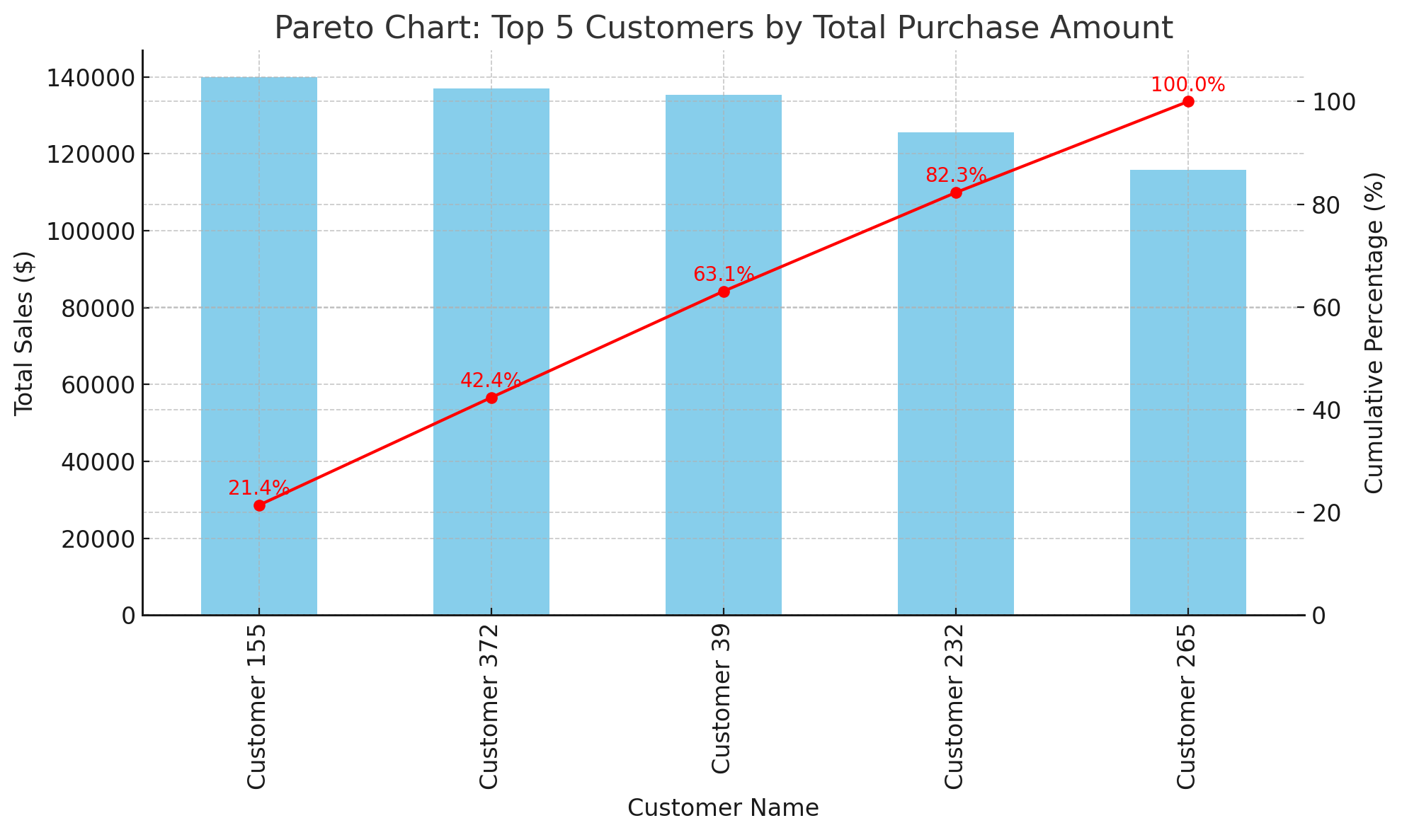
The Pareto chart above shows the Top 5 Customers by total purchase amount. It combines:
- A bar chart (in blue) representing each customer's total sales.
- A line chart (in red) showing the cumulative percentage contribution of these top customers to the overall sales total.
This visualization highlights the 80/20 rule in action—illustrating how a small number of customers contribute a disproportionately large share of revenue.
Let me know if you'd like this chart saved, exported, or adjusted (e.g., top 10 instead of 5).
Prompt: Compare sales vs. expenses by month where expenses were 2 times higher than sales.
Sample Response:
Months Where Expenses Were More Than Twice Sales

The bar chart above displays months where expenses were more than twice the total sales, based on data from the Sales_Records_Table and Purchasing_Records_Table.
Each group of bars represents:
- Total Sales (in light orange)
- Total Expenses (in orange)
This comparison helps identify periods of potential financial imbalance—such as overstocking or inefficient procurement practices. If you'd like, we can drill into specific SKUs, suppliers, or customers responsible for these trends.
Prompt: Which daily sales are outside of a statistically stable process?
Sample Response:
Using a control chart approach—where the control limits are set at the overall daily mean ± 3 standard deviations—we find that:
- Mean Daily Sales (April): $31,431.38
- Standard Deviation: $25,653.33
-
Control Limits:
- Lower Limit: $-45,528.62 (not applicable for sales, as sales cannot be negative)
- Upper Limit: $108,391.37
When filtering for days with sales outside these limits, no daily sales values fall outside the upper or lower control limits. This indicates that all daily sales for April are within the expected range of a statistically stable process.
Prompt: Find any outliers in the quantity purchased column.
Sample Response:
Using the IQR (Interquartile Range) method to detect outliers in the Quantity Purchased column in the Purchasing_Records_Table, we computed:
- Q1 (25th percentile): 56
- Q3 (75th percentile): 153
- IQR: 97
- Lower Bound: Q1 - 1.5 * IQR = -89.5
- Upper Bound: Q3 + 1.5 * IQR = 298.5
Since sales quantities cannot be negative, the effective lower bound is zero. Based on this analysis, any transaction with a Quantity Purchased greater than 298.5 would be considered an outlier.
The analysis of the dataset shows that there are no outliers in the Quantity Purchased column, as no values fall outside these bounds.
The Future of Work Starts in Your Spreadsheet
Public AI Chat systems will not replace spreadsheets, but it supercharges them. These outputs above were each generated in under 1 minute. Even if you are good at formulas, some of these could take 10 – 15 minutes to generate in a spreadsheet.
Picture this: you’re no longer buried in data but collaborating with an intelligent assistant that helps you find answers, spot trends, and generate business reports—all from a simple spreadsheet. That’s not science fiction. It’s happening right now.
But just like a power tool, AI in spreadsheets needs to be used skillfully and safely. Master the setup, ask the right questions, protect your data, and you’ll turn your everyday spreadsheets into strategic assets that drive results.
The age of static spreadsheets is over. Welcome to the era of smart sheets and AI-powered productivity.
Looking for a reprint of this article?
From high-res PDFs to custom plaques, order your copy today!


