Software
The Limits of the Thirty Piece Sample
How do we know when the differences between populations are evidence of real differences, or merely differences to be expected by the nature of random samples?
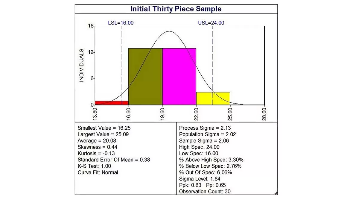
Figure 1: Initial Thirty-Piece Sample
A process was, on an irregular basis, failing to meet the mark, perhaps 5% of the time. The process engineer observed the process in action and took a sample of thirty parts for analysis. The process performance index Ppk was estimated at 0.64, as shown in the histogram of Figure 1, which corresponds to approximately 6% out of specification, supporting the original concern for attention.
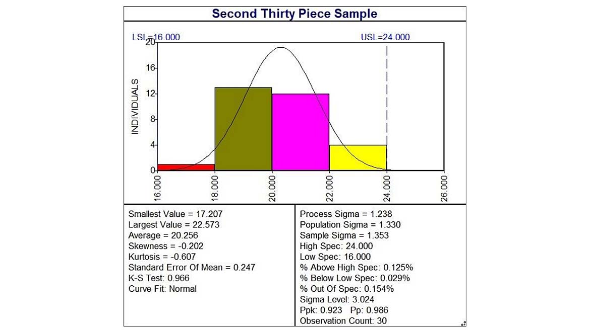
Based on the process observations and the analysis of the collected data, the analyst concluded that the process operators were not following the established process protocols, leading to process deviations. A training session was scheduled and conducted, emphasizing the need for process operators to heed the best practices documented in the process procedures. A subsequent analysis of the process post-training, again with a sample of 30 measurements, indicated the process performance had improved to 0.92 (Figure 2), a noticeable improvement that dropped the error rate well below 1%. Backs were patted for a job well done.
Nonetheless, in short time the process was again misbehaving. Were the process operators up to their old tricks, or was something else amiss with the process? Would another 30-piece sample be helpful?
It would be difficult to say, given the information provided thus far. The process performance index Ppk tells us little to nothing about the process, despite its name. The 30-piece sample provides an estimate of the population from which the sample was taken, without the need to test the entire population. Larger samples provide more precision, with tighter confidence limits, on the population estimates. It’s important to note the resulting process performance index is pertinent only to that population.
The population is defined by the method of sample collection. If you randomly select your 30-piece sample from an entire production lot, then the population is the production lot. If your random sample is from only a portion of the production lot, then your population is limited to that portion of the production lot. If it’s not a random sample, such as taking the last thirty pieces, the population is limited to the sample, and you’ve essentially done 100% sampling on a 30-piece population. In any case, the sample can only provide the means to make inferences about the population from which the random sample was taken.
As such, these population samples are useful only for short-term estimates of particular populations, such as a single production lot. They cannot predict any other population, past or future. They provide only point estimates of the process.
Merriam-Webster defines a process as “a series of actions that produce something or that lead to a particular result.” These series of actions, or process steps, are repeated time after time to generate each result, such as a unit of part produced. From a quality perspective, it is the repetitive nature of the process that is of interest: Is the process capable of consistently performing time after time. Process quality is the ability to replicate the process with minimal variation over time, and the context of time is an intrinsic part of a process analysis. The population-based analysis above ignores the time history of the process, providing information only about the time-limited population sampled. Its usefulness for process improvement is limited, even as its (incorrect) use is not.
Conversely, the process control chart, with samples plotted in the time sequence produced, capitalizes on the fact that the process is replicated over time. By plotting the point estimates in their production order along the x-axis, a control chart can establish the process conditions for the past and current state of the process. When the control chart indicates the process is stable, this stability establishes the ability to predict the future process capability.
The control chart for the above process is shown in Figure 3. Subgroup 3 on the chart consists of the first five measurements from the initial thirty-piece sample discussed above; subgroup 14 is the first five measurements from the second thirty-piece sample.
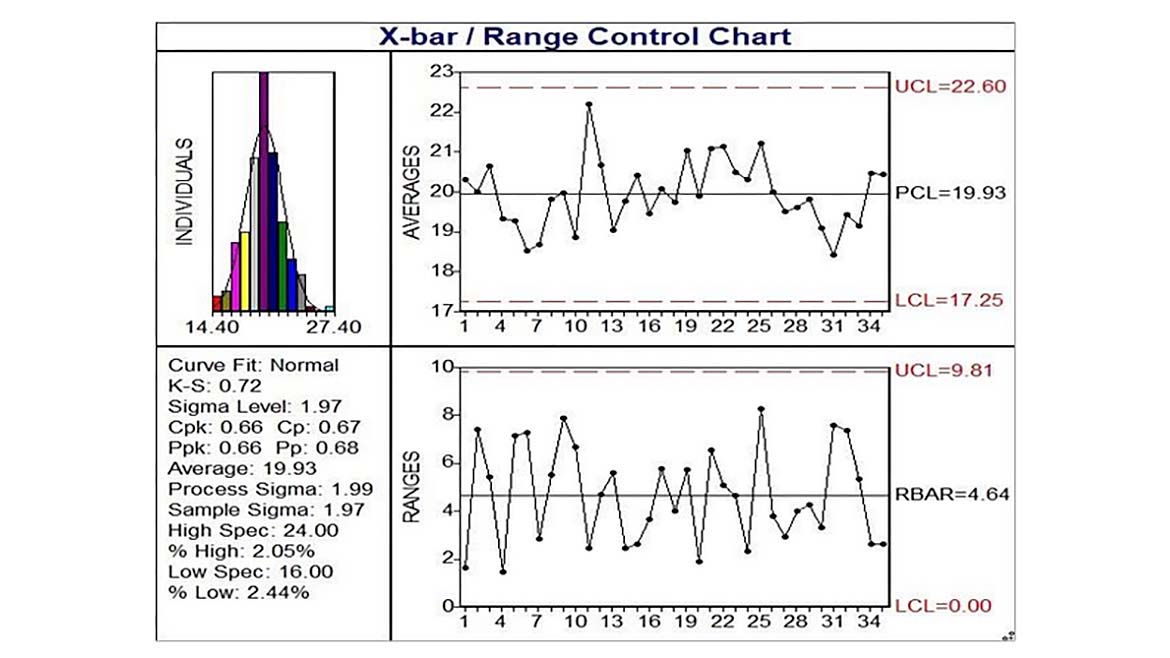
The control chart portion of Figure 3 consists of an Averages (or Xbar) chart (to the right of the histogram), and a Ranges chart (beneath the Averages chart and to the right of the summary statistics). The Xbar chart plots the average of each five-piece subgroup randomly collected at each sample period, which might be an hour, day, or month worth of production, depending on the production frequency and the criticality of the process. The Range chart plots the range or difference between the largest and smallest measurement in the five-piece subgroup. The Xbar and Range charts each have an Upper Control Limit (UCL) and a Lower Control Limit (LCL). These control limits are calculated based on the average and/or range statistics of the plotted data.
The control charts in Figure 3 show a process in control: all plotted subgroups on each chart are within their respective control limits. There are no subgroups plotted beyond the control limits. The central tendency or location of the process, estimated by the average, is stable, as is its dispersion or variation, estimated by the range.
A stable process is predictable. Since this process is in control, the expected bounds of the plotted statistics (the subgroup average and the subgroup range) are defined by their respective control limits. We can predict this process will continue to behave similarly, until it is changed. The Process Capability statistic, Cpk, shown in the Figure as 0.66, is used for stable (i.e. in control) processes. Since this Cpk is less than the often-cited minimum of 1.33, we predict this process will fail to meet requirements unless it is changed. (Note that some customers require a minimum Cpk of 1.67 to assert the process is capable).
A statistically significant change to the process would generally be evident by a plotted subgroup outside of the control limits. (Generally only because it may take more than one subgroup to detect the change, depending on the relative magnitude of the change). An out-of-control process cannot be predicted: It is unstable, and until the cause of the instability is identified and removed you cannot predict when it will reoccur.
Since the control chart of Figure 3 shows a controlled process, we see no evidence of a process change as suggested by the second 30-piece population sample (coinciding with subgroup 14). The differences in the sample average and range between the first and second 30-piece samples reflected random (aka common cause) variation in the process, which we could not measure with the population-specific samples we took earlier. There are zero out of control conditions, which would indicate a process change, near subgroup 14, so the training provided no noticeable effect.
This highlights a particular problem with population-based analyses: How do we know when the differences between populations are evidence of real differences, or merely differences to be expected by the nature of random samples? You might think confidence intervals would be helpful here: If the confidence intervals don’t overlap, then we’d infer the populations were different. Sometimes you’ll be lucky with this approach, and with a sufficiently large sample (usually more than 30 pieces in these samples) you might see statistical evidence that one population’s average is different from another’s. Yet, it would still provide no quantification of the process, and how these populations relate to the overall process output.
The control chart provides the context to understand the process variation and is the only statistical technique available for properly quantifying a process. So, when you’re trying to baseline a process, either to ensure it meets customer requirements or in the Measure stage of a Lean Six Sigma improvement project, the control chart is the right tool.
Looking for a reprint of this article?
From high-res PDFs to custom plaques, order your copy today!


